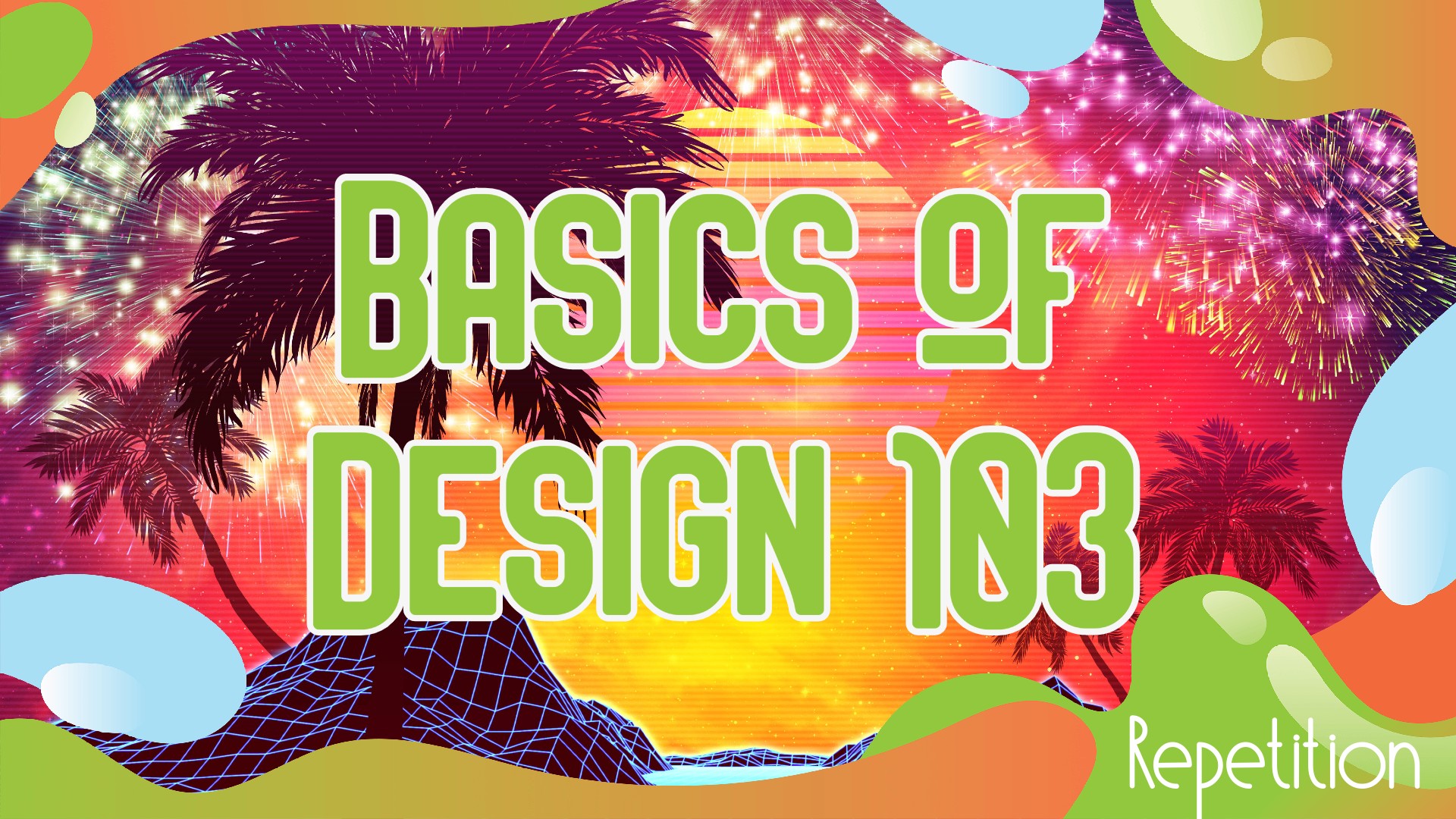
Are you ready to learn more about design? This is part three in the series (101, 102). Today we cover something ubiquitous, but you don’t notice until you learn about it. It’s called repetition.
Repetition is using various techniques, such as color or design, to make the art flow together. On a one-page document, like a business card, it may be repeating fonts or having small birds in each corner. It consists of you showing the reader that this art is one solid piece. I have been using more borders to help with my repetition.
On multiple-page documents, like long brochures, repetition is even more vital. You will want to have the same border, fonts, colors, etc., to show the reader that the documents belong together like pieces of a whole. If one of the pages fell from the document, the reader should know that it belongs to the group.
I have been using repetition a lot since I read “The Non-Designer’s Design Book.” Even if I feel the piece is okay without it, I add a little flare to it to ensure continuity across the work. Now let’s look at some of my examples, then I will provide some samples for you to explore without commentary.

This is an easy one: the colors red, white, and blue, of course. But also the fonts of FINANCIAL INDEPENDENCE are the same.

The repetition for this piece is the colors black and white. The colors ensure that the work is consistent across both halves.

This is a good one. The colors of the font match the colors of the sky, and the ribbon is the lady’s hair. Most notably are the spy figures in the thought bubble and the left corner. This helps the artwork feel more like one large piece.

Maybe a sneaky one. Look at the little people in the corners. You may have missed that the first time around. Those little flourishes are Easter Eggs for your most loyal fans. Now, let’s give you some samples for you to practice.

This one should come very easy! Lol. Next!

Okay, there are two examples of repetition in this one; can you find them both?

Okay, this should be easy. You are becoming a professional. And for the last one, I will show two different pieces of work. What elements represent repetition between the two?


Two very different meanings but very similar pieces. I love repetition.
I hope you enjoyed those samples. If this stuff interests you, go ahead and buy the book “The Non-Designer’s Design Book” by Robin Williams. I would be doing a massive disservice to her by trying to re-create her teachings. I absolutely adore design after understanding these simple principles.
 Download Passive Income Printables for Your Financial Journey (here)
Read My Books for Free: Free Kindle Books Schedule also on Kindle Unlimited Join me on the best app for Crypto- Voyager
Follow us on our Facebook Page (here). Join our Facebook group (here)
20 Books that Will Make You Rich (here) part 2 (here)
See all my books on Pinterest (here)
Disclosure: I am not a financial advisor or money manager, and any knowledge is given as guidance and not direct actionable investment advice. I am an Amazon Affiliate. Please research any investment vehicles that are being considered. I wrote this article myself, and it expresses my own opinions. I am not receiving compensation for it. I have no business relationship with any company whose stock is mentioned in this article.
Leave a Reply