Here we go with our first principle of design: contrast. We use contrast to attract the reader’s eye and also lead them along with the page. If we did not use contrast, everything would seem important, or everything would seem unimportant.
We can use contrast with color, size, weight, boldness, fonts, etc. We want to draw the reader to our work and then have them focus on an element. For there, if you have grabbed their attention, they will seek other information around the page.
Imagine that you put up one of your flyers on a wall full of flyers. How would you attract the viewer’s eyes to your piece? It would be the use of contrast on your brochure that would attract them. For more on contrast please read the book “The Non-Designer’s Design Book.”
Now Let’s review a few examples of contrast from my own works. I will leave a couple of samples at the end without commentary, so you can decide what contrast I used.

Happiness isn’t Free. I used the color red to contrast the rest of the fonts. But the shadow is the main difference. I also increased the size of the word FREE.

I used size, font, and color to make the word PASSIVE stand out. I also used size to make the terms RUN A contrast.

This is a reverse contrast. I used the size and font to make the words BECOME A BONAFIDE INVESTOR PART III not stand out. If someone is drawn to this art, they will discover that it is part of a series.
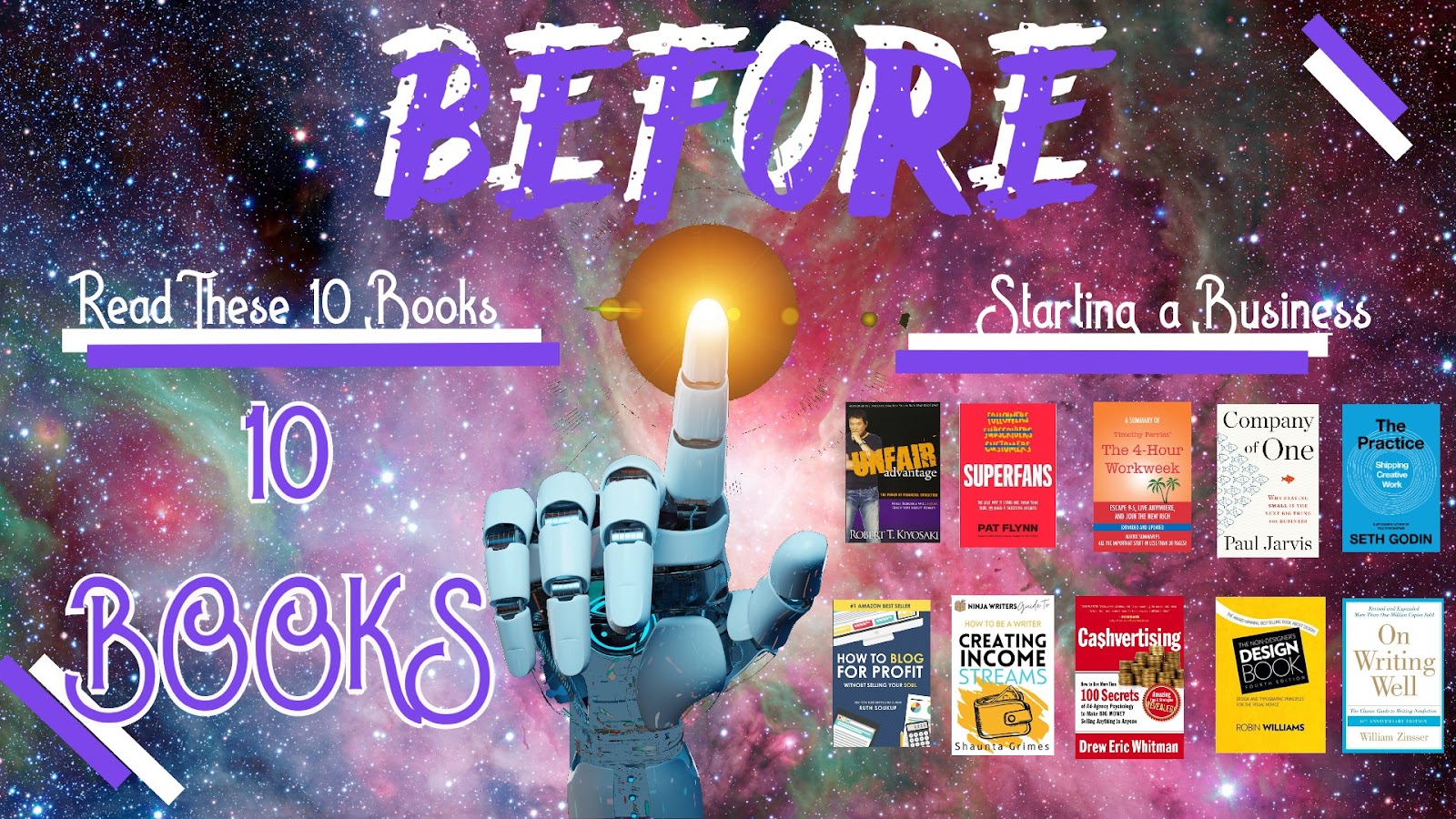
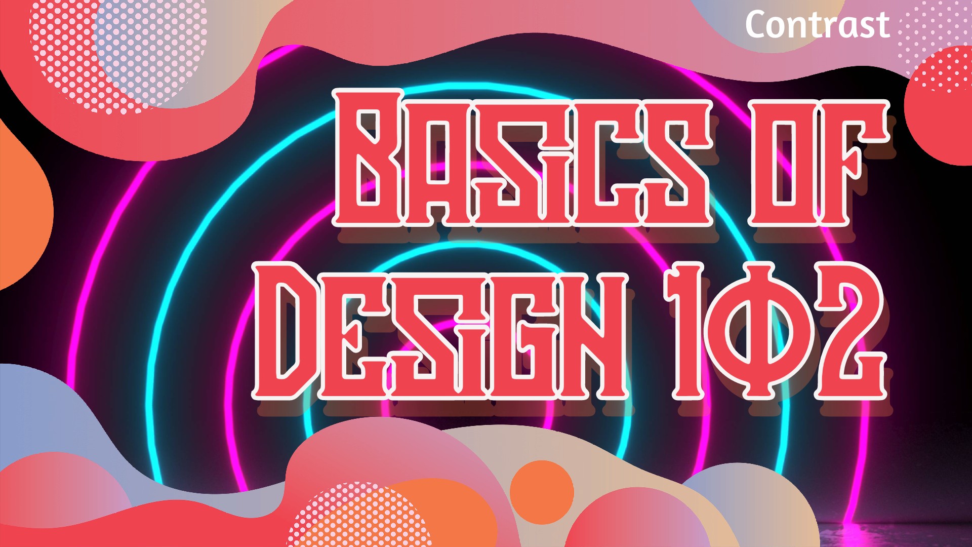
I wanted to stress the word BEFORE in this art. I used placement, size, color, and shadow to make this word stand out and ensure the reader sees this first.

Sample #1: Okay, now your turn. This one should be easy.

Sample #2: Okay, how about this one. What draws you to the scene first?

Sample #3: This is a little subtle. There is also a hint of another principle, repetition.

Sample #4: Final one. This one could be tricky. What did I use to make something stand out?
I hope you enjoyed those samples. If this stuff interests you, go ahead and buy the book “The Non-Designer’s Design Book” by Robin Williams. I would be doing a huge disservice to her by trying to re-create her teachings. I absolutely adore design after understanding these simple principles.
 Download Passive Income Printables for Your Financial Journey (here)
Read My Books for Free: Free Kindle Books Schedule also on Kindle Unlimited Join me on the best app for Crypto- Voyager
Follow us on our Facebook Page (here). Join our Facebook group (here)
20 Books that Will Make You Rich (here) part 2 (here)
See all my books on Pinterest (here)
Disclosure: I am not a financial advisor or money manager, and any knowledge is given as guidance and not direct actionable investment advice. I am an Amazon Affiliate. Please research any investment vehicles that are being considered. I wrote this article myself, and it expresses my own opinions. I am not receiving compensation for it. I have no business relationship with any company whose stock is mentioned in this article.
Leave a Reply