Very rarely do I feel like an idiot. But reading a book by a graphic designer showed me how ignorant I am of the world of design. Maybe idiot is too harsh of a word, but I was genuinely inspired by the works that she presented in the book.
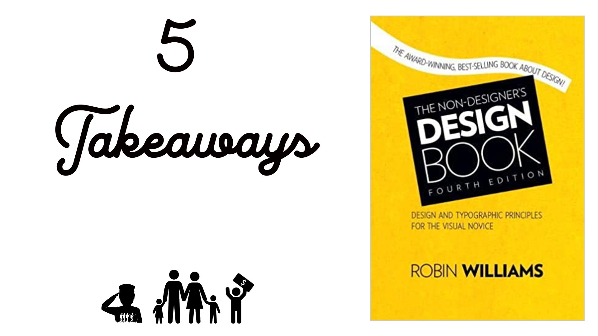
“The Non-Designer’s Design Book” by Robin Williams is a glorious masterpiece and should be the first book on any entrepreneur’s “to-read” list. Yes, you may hire someone to do your design and advertising work for you, but how do you know if they are good at it?
Being able to walk away with the basics of design has already been an enormous help. I design artwork for my blog posts each and every day. I have already developed 4-5 posts since reading the book, and I can see a stark difference between my works.
I will go ahead and get into my five takeaways because there is honestly too much to talk about in this short timeframe. I cannot praise this book enough and I could probably write 2,000 words of just the ideas that the book has inspired. A word of note: I would recommend reading this book on a device with color, like a tablet or PC. She goes into very colorful descriptions and examples, and you will need to see what she is describing.
1) There are four basic principles of design. They are Contrast, Repetition, Alignment, and Proximity (insert acronym here). You will most likely have to use a combination of 2-4 to get great results from your piece. These principles also apply to using typefaces (fonts) to make a statement.
2) Contrast is the difference between two or more objectives. It can be size, weight, color, etc. Using contrast is essential and knowing how the readers’ eyes flow through the page is vital. Use contrast to control the eyes.
3) Repetition means using elements to tie different parts of the piece together—this can be fonts, clip arts, colors, etc. If doing a magazine, how are all the pages tied together? Use repetition to present one cohesive package to the reader.
4) Alignment. There should be only one alignment per piece. Alignment is right, center, and left-justified. Alignment does not speak to the position of the text but the alignment of the letters. Use center alignment sparingly. It looks amateurish. I went back, and every single one of my artwork was center-aligned. I could have cried.
5) Proximity. The use of proximity helps the reader know how to group thoughts on your piece. If you have lots of information to present, you will want to ensure that your groupings are tight and allow the reader to flow through the report as you intend.
Becoming an entrepreneur is an advantageous endeavor. I have read books on advertising, blogging, writing, and now designing—together, they have armed me with enough to be a basic entrepreneur. I can at least present a somewhat presentable package going forward.
I am not going to run off and try to be a “designer of the year.” I am taking the long road and slowly and deliberately putting these design elements into action. Seeing how amazing her designs were literally made me gasp.
She starts with a mundane piece of work and shows us how to jazz it up. If I can even do 30% of what she presented, I will be more than happy. I think everyone should read this book, even children. We all have to design stuff throughout our lives, and knowing some of the basics can be a real head-turner. This book is a must-read for everyone. And the color is vibrant and addicting in the book.
Read My Books for Free: Free Kindle Books Schedule
Check out our Merchandise Shop on Redbubble: (here)
Follow us on our Facebook Page (here)
Join our Facebook group (here)
Follow us on Pinterest at:
Disclosure: I am not a financial advisor or money manager, and any knowledge is given as guidance and not direct actionable investment advice. I am an Amazon Affiliate. Please research any investment vehicles that are being considered. I wrote this article myself, and it expresses my own opinions. I am not receiving compensation for it. I have no business relationship with any company whose stock is mentioned in this article.

Leave a Reply